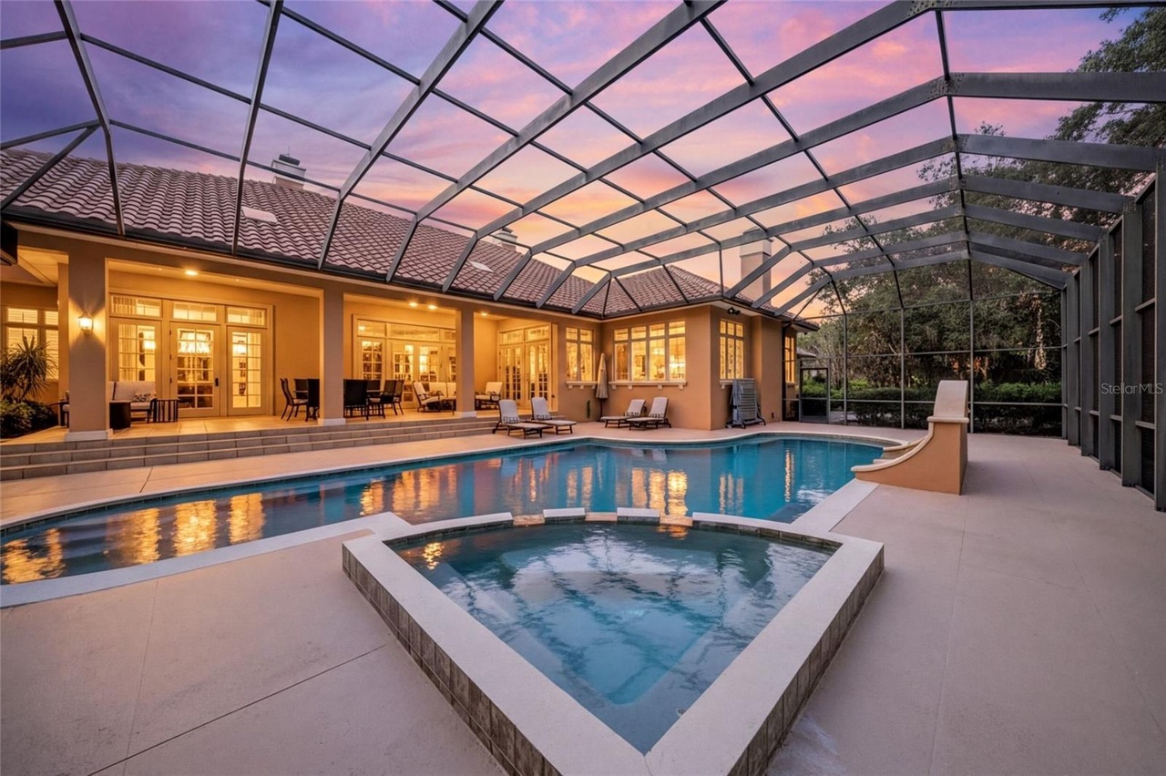
Warm Color Palettes for Fall: Rich Tones in Luxury Interiors
The Seasonal Palette Shift
Fall triggers a natural desire for warmth in interiors. The bleached, airy palettes of summer give way to richer, more grounded tones — not because we repaint walls seasonally, but because textiles, accessories, and lighting shift the room's temperature.
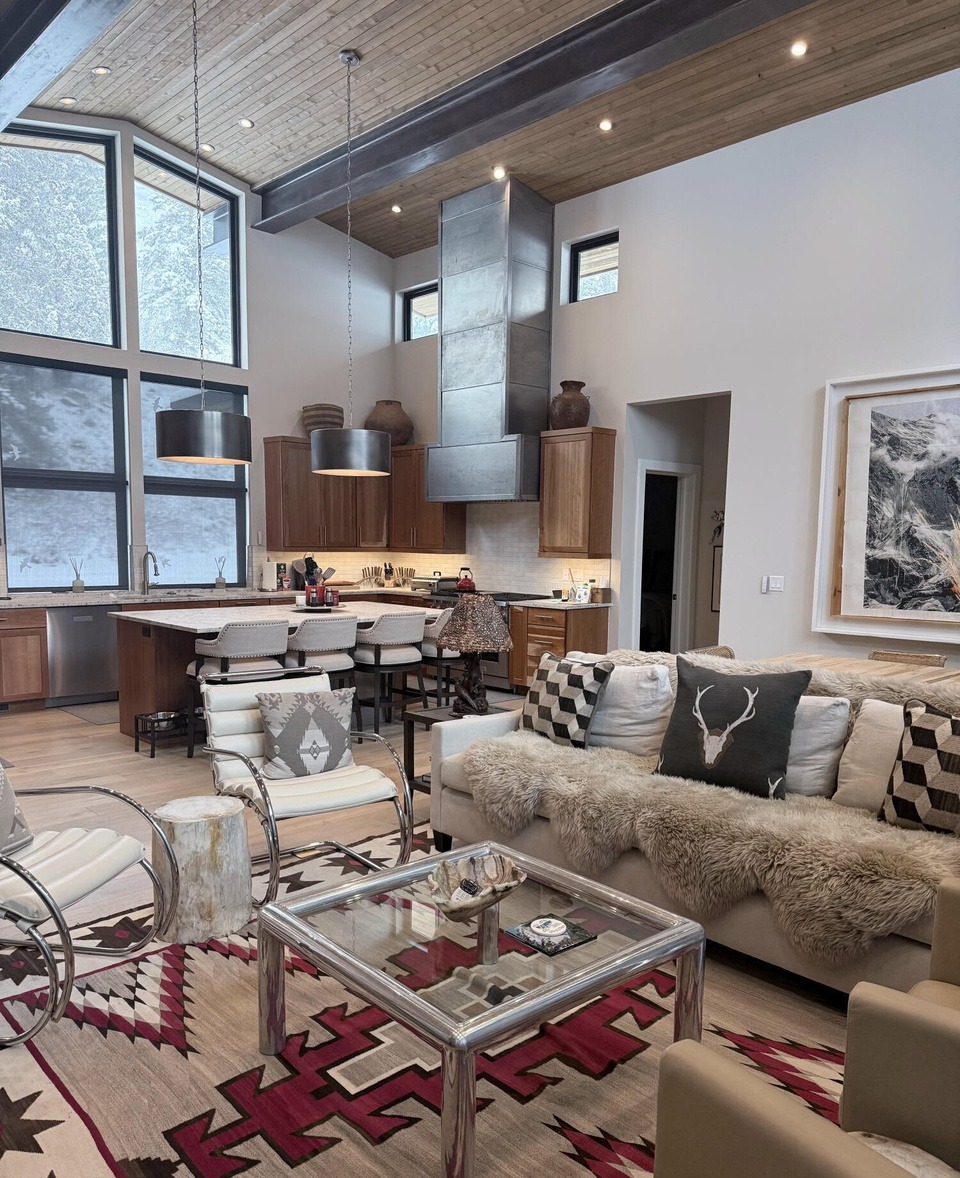
The most effective fall palette isn't about adding orange. It's about deepening existing warm tones and introducing earthy richness: camel and cognac leathers, olive and sage textiles, terracotta ceramics, and warm metallics like aged brass and copper.
Applying Warm Tones in Luxury Spaces
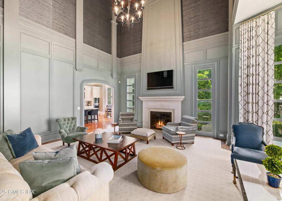
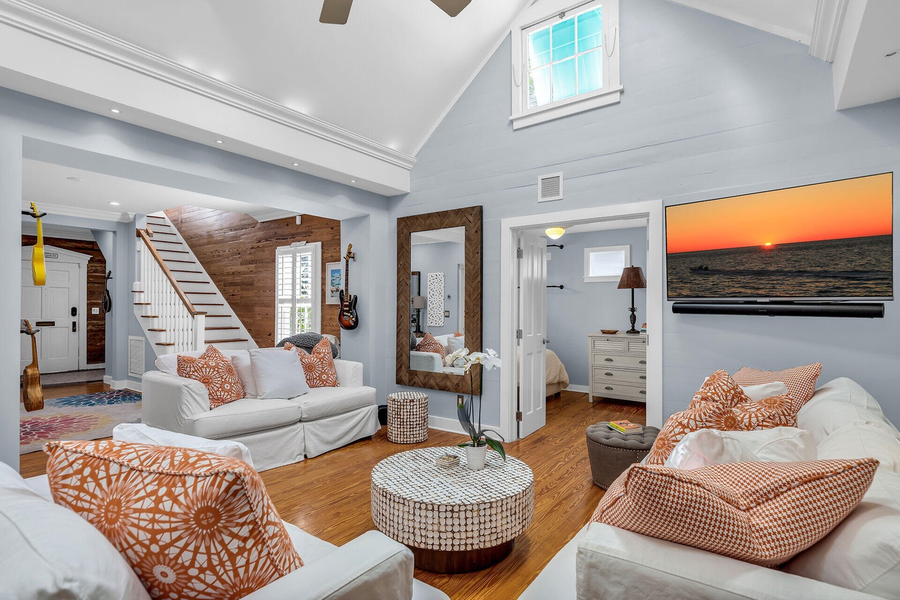
In living rooms: swap summer throws and pillows for heavier versions in deeper tones. A cashmere throw in camel, velvet pillows in forest green or wine, and a rust-toned ceramic vase shift the room's mood without permanent changes.
In bedrooms: heavier bedding in warmer colors — a duvet cover in warm linen, additional blankets in complementary earth tones. Switch white sheets for cream or sand-colored ones.
In dining rooms: this is where fall palettes shine. Warm wood tables, candlelight, linen napkins in terracotta or olive, and ceramic tableware in earth tones create the quintessential fall gathering space.
The Year-Round Warm Palette
Some spaces work best with a permanent warm palette — rooms that face north (already cool-lit), rooms without much natural light, and spaces meant for evening use (dining rooms, libraries, bars).
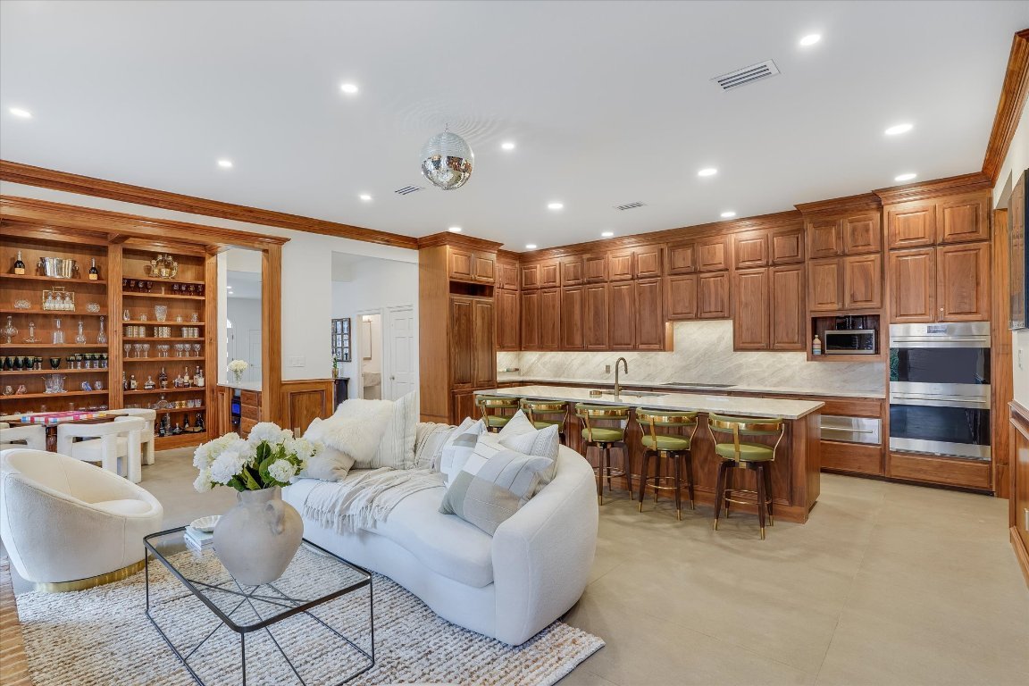
For these rooms, commit to warm materials: walnut over white oak, brass over chrome, honed stone over polished, and paint colors with warm undertones. The room will feel inviting year-round, and the fall transition happens naturally.